Showing posts with label Mobile. Show all posts

Tuesday, March 3, 2015

Google Search results just became more mobile-friendly

(Originally posted on the Webmaster Central Blog)

As more people use mobile devices to access the Internet, Google Search has adapted its algorithms to help users find mobile-friendly web pages and apps. Recently, Google Search has made it even easier for users to discover multi-screen content with two important changes:

1. More mobile-friendly websites in search results

Starting April 21, Google Search will be expanding its use of mobile-friendliness as a ranking signal. This change will affect mobile searches in all languages worldwide and will have a significant impact in Google Search results. Users will find it easier to get relevant, high quality search results optimized for their devices.

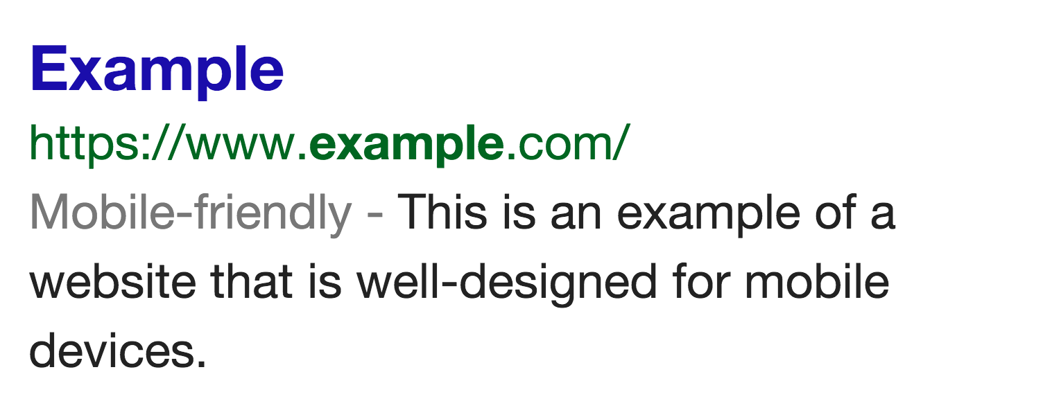
To make sure your website is ready for this change, check out the guide to mobile-friendly sites and start building your multi-screen website today. You can test out how your site is performing with the following tools:


If you already have a multi-screen website, check out our Multi-Screen Implementation Guide to optimize your website for the best user experience and monetization. You can use the Mobile Search Engine Optimization guide to help your site show up in search results.

2. More relevant app content in search results

Recently, Google Search began to use information from indexed apps as a factor in ranking search results displayed to signed-in users who have the app installed. As a result, Google Search may now show content from indexed apps more prominently in search. If you have a mobile app, learn more about App Indexing, and allow Google Search to show this information in search results.

Posted by Inside AdSense Team

(Original post by Takaki Makino, Chaesang Jung, and Doantam Phan)

Friday, February 13, 2015

Love is all around: 8 tips romantic movies can teach us about content strategy (Part 4 of 4)

Welcome to the last part of our Valentine�s Day blog series. Today, we�ll explore what eight of the most loved romantic movies of the last few years can teach us about content strategy.

Romantic movies are always a popular choice for Valentine's Day. In the spirit of this special day, we watched some classic romantic movies (for research, of course) to see what they can teach us about content strategy.

Here�s the top tips we found:

1. P.S. I Love You - Have a single common goal

Gerry and his series of letters were designed to encourage Holly to move forward to a new life. Similarly, when you�re creating a series of content pieces, ensure that they have a single common goal or call to action such as email sign-up. All pieces of content should link together and guide your visitors toward a desired goal or call to action.

2. 10 Things I Hate About You - Use list-based articles

This one comes directly from the title of the movie. List-based articles (listicles) provide a great way to deliver your message in a structured and engaging way. Keep them short and easy to read to grab the attention of your visitors.

3. When Harry Met Sally� - Make your content memorable 

When you ask someone what they remember about this movie, it�s highly likely that they will respond with one of several key scenes. Why? Because the film masterfully creates scenes that are both embarrassing and hilarious, making them very easy to recall. When you�re creating your content, ask yourself �Does this content have at least one memorable moment? Is there something that will stick with the my visitor?"

4. Love Actually - Link content pieces to each other

Love Actually tells nine intertwined stories with a common emotion, �love�. Consider all of the content on your site pages in a similar way. Each piece of your content may target one particular theme or audience but in the end, they should serve the same purpose.

5. You�ve Got Mail - Use email marketing

When you�re selecting your distribution channels for your content, make sure to use email. It can be an effective, easy, and inexpensive way to keep your visitors up to date. It also offers a great way to reach your mobile audience.

6. The Princess Bride - Know your audience

For a particular audience, the Princess Bride is the most romantic movie of all time. For others, it doesn�t even rate. This is because the film resonates with a certain audience. In the same way, if you know your audience, you can craft successful content. Get to know your audience more by using experimentation, market research, and other tools.

7. Pretty Woman - Bring unique value to your content

Pretty Woman is a modern retelling of the classic Cinderella story. Similarly, the subject of your content doesn�t have to be a completely original thought or subject matter. Your visitors want to see your personal opinion or a unique value in your content. Start by asking yourself �What is the unique value I�m adding to the subject matter?� or �What am I providing that no one else is providing?�

8. Forrest Gump - Provide a good user experience

To refer to Tom Hanks� iconic line in Forrest Gump in a modern content strategy way: �Life is like a box of chocolates. You never know what screen you�re gonna get.� Thanks to the rapid growth of mobile traffic, your content is now viewed on multiple devices. If your site is still not multi-screen optimized, check out our Multi-Screen Starter Guide, and if you already have a multi-screen website, ensure you�re giving your audience the best visitor experience by using the Multi-Screen Implementation Guide.

To wrap up, try thinking about these eight tips and how they can be applied to your content strategy. Are you giving your content the love it deserves? Much like Rick and Ilsa in Casablanca will �always have Paris� together, remember that you and your visitors will always have your content, if you get your strategy right. 

Posted by Chris Jones, Audience Development Specialist
Was this blog post useful? Share your feedback with us.

Friday, September 12, 2014

Work with a vendor to improve your mobile user experience

Did you know you can hire a third-party vendor to help you build a multi-screen site? Our certified vendor partners are helping AdSense publishers like you create and optimize mobile sites, giving users a better experience regardless of the device they're using.

If you don't have the time or expertise to build a mobile site, working with one of our certified vendors can be an easy way to ensure that your users have a great mobile experience. These vendors offer a broad range of services for building a mobile site, ranging from simple to highly customizable solutions.


Regardless of the complexity of your site and the resources available to you in-house, there's a vendor to suit your needs. You'll find more information about certified vendors in the Multi-screen guidelines section of our Help Center.

Posted by Wibe van de Vijver - Inside AdSense Team
Was this blog post useful? Share your feedback with us.

Wednesday, September 10, 2014

Google AdSense answers multi-screen FAQs

We recently opened a new category called Going Multi-Screen in the AdSense Help Forum* where you can post questions and share your experiences about multi-screen optimization. In today�s post, we will summarize the top five FAQs received to date. We hope you find these helpful.
  1. Optimizing websites for multiple screens requires resources and commitment. Is it worth my time and investment?
    Yes, going multi-screen is worth your time and investment, although it's not always something you can accomplish in a day. Our research shows benefits to both monetization and user experience. On average, publishers with mobile-optimized sites can have 8% higher RPM and their site traffic grows twice as fast as non-optimized publishers.** Having a mobile-optimized site can also help you to improve time spent on site and bounce rate.

    Furthermore, since global advertiser spending on mobile ads is expected to increase by 52% in 2015, you could benefit even more from this trend.***

    As Evan Britton, the founder of FamousBirthdays.com, said: The important thing to realize is that growth in the mobile market is all about offering a better experience the potential in the mobile space to grow ad revenue is huge. (find more publisher stories)
  2. I'm planning to create a responsive website. How are responsive ad units performing? 

    We've found that responsive ad units generally perform better than normal ad units as they work in line with responsive layouts. This helps to improve the experience for your mobile users. We recommend using the smart sizing mode if you're just starting out, but there's also an advanced mode if you're looking to customize ad sizes on a more granular level. You can find code samples for the advanced mode in the Help Center.
  3. What are the best practices for mobile site ad placement?

    The best ad placement will depend on your own site content and structure, but you can see our recommended placements for mobile sites below. We recommend that publishers use the large mobile banner (320x100) and medium rectangle (300 x250) sizes, which are high performing and fit nicely on your mobile screen.
  4. What's the maximum number of ads allowed on mobile pages?

    You can place up to three content ad units per page on your mobile sites. This is the same number of ad units allowed on desktop sites. For smaller screens, carefully consider the balance of content and ads so that users can find the information they're looking for. Please avoid showing only ads on your first screen.
  5. How can I improve the user experience on my mobile site?
    To check your mobile user experience, try the PageSpeed Insights tool and read the suggestions in the user experience section. For more detailed and technical approaches, we recommend you go through the Web Fundamentals resource on the Google Developers site. You'll learn more about how to deliver your content as quickly as possible, optimize images and videos, and improve the mobile experience for users. If you'd like to see some examples of good mobile site design, check out the white paper, Principles of Mobile Site Design.
Still have questions? Visit the forum and start a conversation with other publishers to learn multi-screen best practices.

* Currently only available in the English, Spanish and Japanese Forums
** Source -  Google internal data, please note that results may vary
*** Source - Global Ad Spending Growth to Double This Year, July 19, 2014 (digital advertising spending includes paid media spending on ads of any format delivered to any internet-connected device, mobile Internet ad spending includes display and search.)

Posted by Maiko Fujita - Multi-Screen Specialist
Was this blog post useful? Share your feedback with us.

Thursday, September 4, 2014

Web Fundamentals and Web Starter Kit: Resources for modern web development

In recent years, mobile devices have brought the web to new users and introduced many new device capabilities, screen sizes, input methods, and more. To help publishers and developers navigate this new space, the Google Developers team recently built Web Fundamentals, a useful source for modern best practices aimed at web developers. We�ve also made it even easier to build multi-device experiences with the Beta release of the Web Starter Kit.

Whether you are creating a mobile site yourself or hiring a developer to create one for you, this resource will offer you useful guidelines to get started.
Web Fundamentals' guidelines are intended to be fundamental to the web platform: useful no matter which framework you choose or which browser your users run. The guidelines include a range of useful articles to help you build a site including articles focused on responsive layouts, forms, touch, and performance, just to name a few.

Inside Web Fundamentals you will find a web starter kit - a lightweight kit to help you or a developer get started with creating your mobile-optimized site. This kit is highly useful and includes helpful tools, including a visual style guide, that you can implement on your site.
Keep in mind, this content is pretty technical and is geared more towards web developers.  If you find the content to be too technical, we do offer a list of recommended vendors that can help you build a mobile-optimized site.

Keep an eye on this space moving forward. We will be updating the Web Fundamental guidelines with more content and resources in the future.

Posted by Matt Salisbury,  Multi-Screen Specialist
Was this blog post useful? Share your feedback with us.

This blog post was adapted from content originally posted on the The Chromium blog.

Wednesday, September 3, 2014

Responsive web design gives FamousBirthdays.com a mobile advantage

Wondering which web design approach is best for mobile? Evan Britton of FamousBirthdays.com had the same question back in 2012. He looked to Google to help develop a mobile strategy for his website, deciding on responsive web design (RWD) as the best solution for his needs.

Evan chose RWD for a host of reasons, especially as it meant the site would adjust to fit various screen sizes, giving users a positive experience regardless of what device they visited from. Additionally, he liked that RWD is low maintenance once implemented, allowing him and his team to focus on growing the site.

Before implementing RWD, FamousBirthdays.com received around 100,000 mobile visits a month. After implementing a mobile-optimized site, this number grew to over 2 million. Evan believes that �the potential in the mobile space to grow ad revenue is huge�, and attributes this twenty-fold mobile growth to better user experience after implementing RWD. Today, the site employs a team of twelve to manage their fast growth. Evan claims, �without RWD, we would not have been able to grow as quickly.�


Read the full story, and hear from other publishers who have successfully adopted a multi-screen strategy, over in our Help Center.

Elise Thygesen, AdSense Multi-screen Specialist
Was this blog post useful? Share your feedback with us.